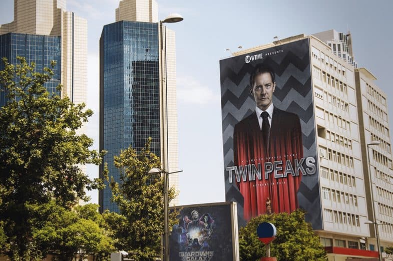
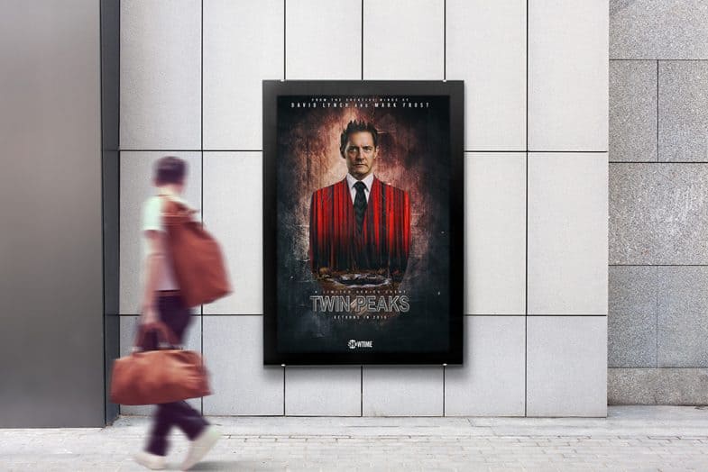
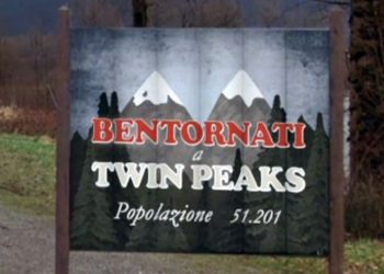
I think I’m only going to believe Twin Peaks is happening again the very moment I see Showtime‘s billboard announcements, bus banners, and subway posters out in the wild, hopefully, early 2016.
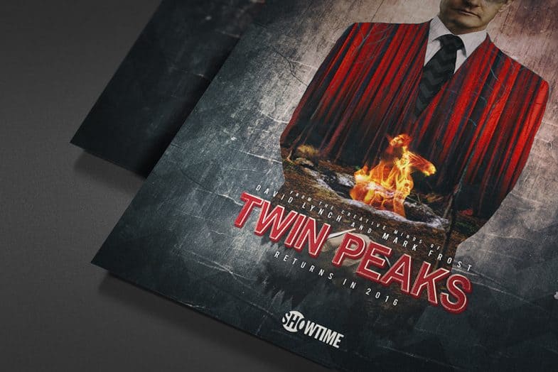
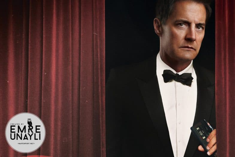
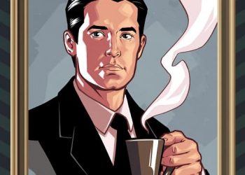
But because Twin Peaks fans are creative like that, you can already get a grasp of how that would look approximately 1.5 years in advance. Just like he designed a packaging mock-up for the Twin Peaks Blu-ray months before the 10-disc set was officially announced, Istanbul-based art director Emre Ünayli already imagined what a promotional poster campaign for the 2016 Twin Peaks Revival could look like.
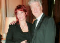
I’m a huge fan of Twin Peaks. Like “I want to be buried in Snoqualmie, WA when I’m dead” huge. So the latest news of the show’s revival on Showtime after 25 years was the best entertainment news that I could ever get. This is my proudest work yet.
—Emre Ünayli
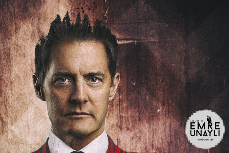
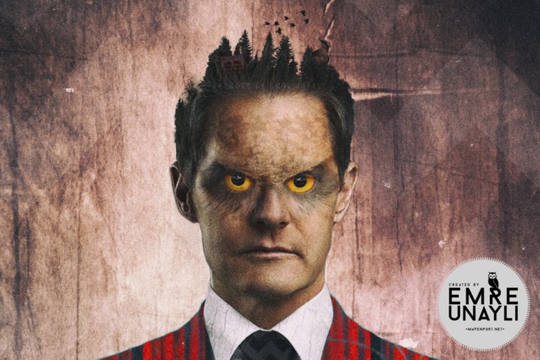
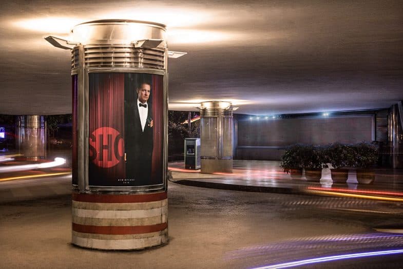
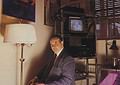
Because of Kyle MacLachlan’s recent tweet, Emre safely assumed he’d be a key player and based the creative on a more recent portrait of the actor. Can you imagine a 16-feet high Dale Cooper looking you straight in the eyes?
No? Well, then please continue.
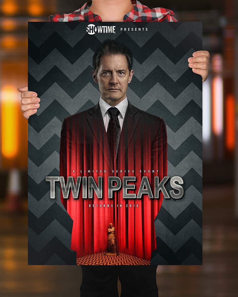
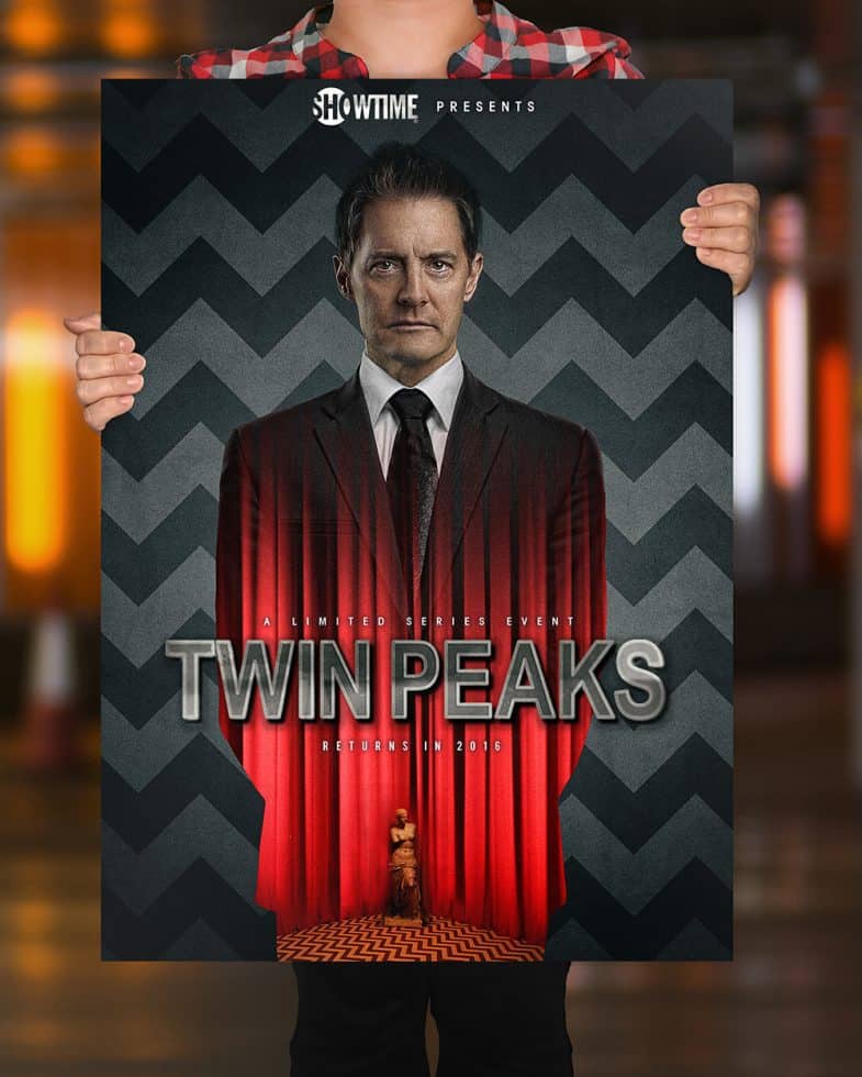
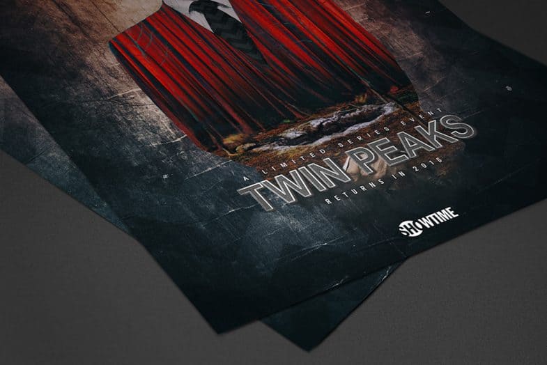
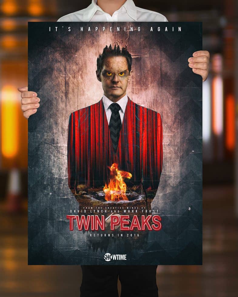
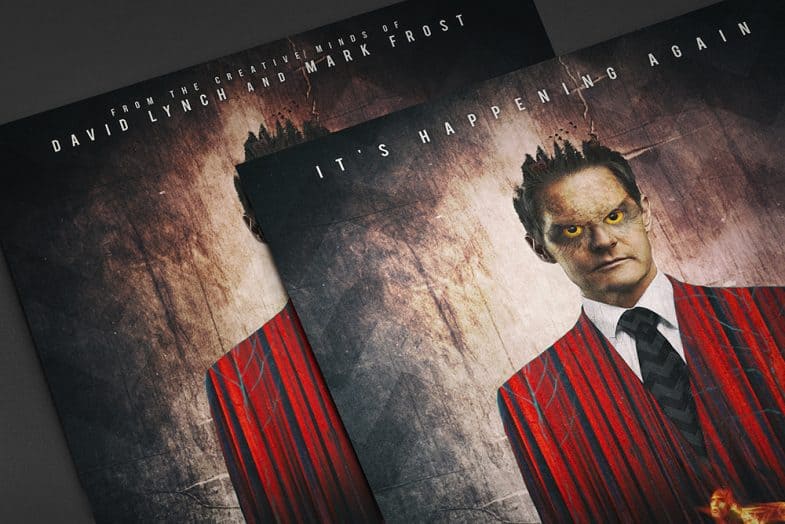
Showtime Presents: A Limited Series Event. Twin Peaks Returns in 2016
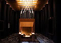
The Red Room Version
The White Lodge Version
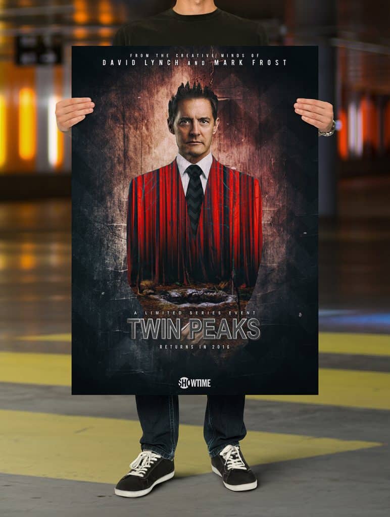
The Black Lodge Version
Teaser Poster
Holy yikes, these are good. Put a white border around it so that it’ll look perfect next to my FWWM poster and I’ll buy one! 🙂
These are awesome! Love them all except the one with the owl eyes, that one doesn’t do it for me.
If someone told me these were legit (besides the owl one), I’d be convinced 🙂
please, get rid of the OWLEYES!! the rest are FANTASTIC!
Aghh man, I loved the owl eyes 😛 It was inspired from that awful looking “Owl Faced Bob” effect on the series. Well, I don’t know, if you didn’t see Cooper with normal face, it just doesn’t seem that bad, but after you see the “normal” face it looks funny, i know. Agh well what you gonna do 🙂 Thank you for your likes and comments.
Amazing work! I like them all, but Emre should remove that statue in the corner of red room. That was some art created in 2007 for the gold box set. The statue never appeared in that place or as orange like that. Yes, I know that I’m nitpicky. 🙂
Haha. Well they used that in DVD’s original promos so why not? I didn’t have enough resources or any hq pics from The Black Lodge to use it instead. I’m glad you care enough about these to be nitpicky about it 🙂 Cheers.
“This is, excuse me, some damn fine fan art.”
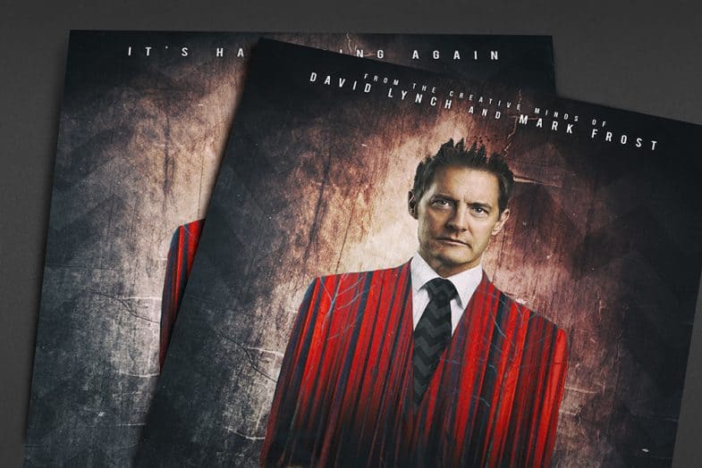
Also, if the tagline “It is happening again” were at the top of the first poster instead of the Showtime logo it would be even better! Add Lynch and Frost’s names along the bottom somewhere (or typical poster credits) and it would be absolutely spot-on perfect.
Excellent work!
I tried to do that, but the Showtime Presents logo should have to be on the top because otherwise you couldn’t see it in the billboard mockup because of the trees. I know it’s a very lame excuse, but i spent almost 3 days of doing these and mockup part was the last 10 minutes and I was so lazy to change it back 😀 But i’ll consider this in the near future when i’m showcasing my work 🙂 Thank you so much.
When I saw the fan designed Showtime billboard with Coop’s jacket morphing into the red lodge curtains, my first impression was the possessed Dale Cooper had become a federal judge during the intervening 25 years. Imagine what mischief the owl-possessed Dale Cooper could accomplish as a federal judge!
Looks great! Now, where can I buy one?
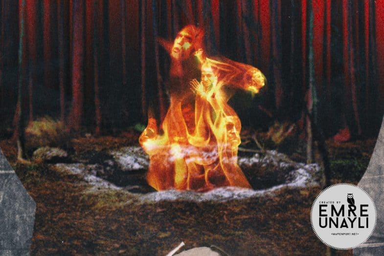
I so would love to own these. Please make this a possibility, as you will hear the same from hundreds more like me. Even the one with Coop’s Venus Penis.
MASTERPIECE. There is no other word.
Congratulations to Emre. All posters are awesome! I’m sure that this is just beginning! Good luck!
What an amazing work, love your posters.
Would love to find somewhere to buy them.
🙂
Well done, doth the cap!
That’s some creativity! Won’t be surprised if they get official endorsement
These are outstanding !!
Great job! Looking forward to see more!
You got to show these to David Lynch!
The current season of Doctor Who uses a title sequence which was originally created by a fan who originally posted it on YouTube. I hope the same kind of thing happens here and Showtime or Lynch Frost Productions endorse these and make them official. I’m not so keen on the owl eyes but overall these are superb and have really got me excited for the show’s return next year – so they work!
On another note, I wonder if they will update the original Twin Peaks title sequence. I think they will have to – they could do something new and original along the lines of these posters and still keep the original music or a new adaptation of it.
By far….The White Lodge Version is the BEST!
The owl face on Coop is not working.
The Venus state in the Red Room Version looks to much like his “private member”.
Just my straight-off feedback….FWIW.
Emre, your design work is FABULOUS!!!!
Are you implying Coop has a small “statue”?