No products in the cart.
Newly Restored Mulholland Drive Supervised By David Lynch Coming To Criterion On Blu-Ray & DVD (Plus Check Out Some Rejected Cover Art)
The Criterion Collection is releasing Mulholland Drive on Blu-ray and DVD along with new extras featuring David Lynch, Angelo Badalamenti and cast members.
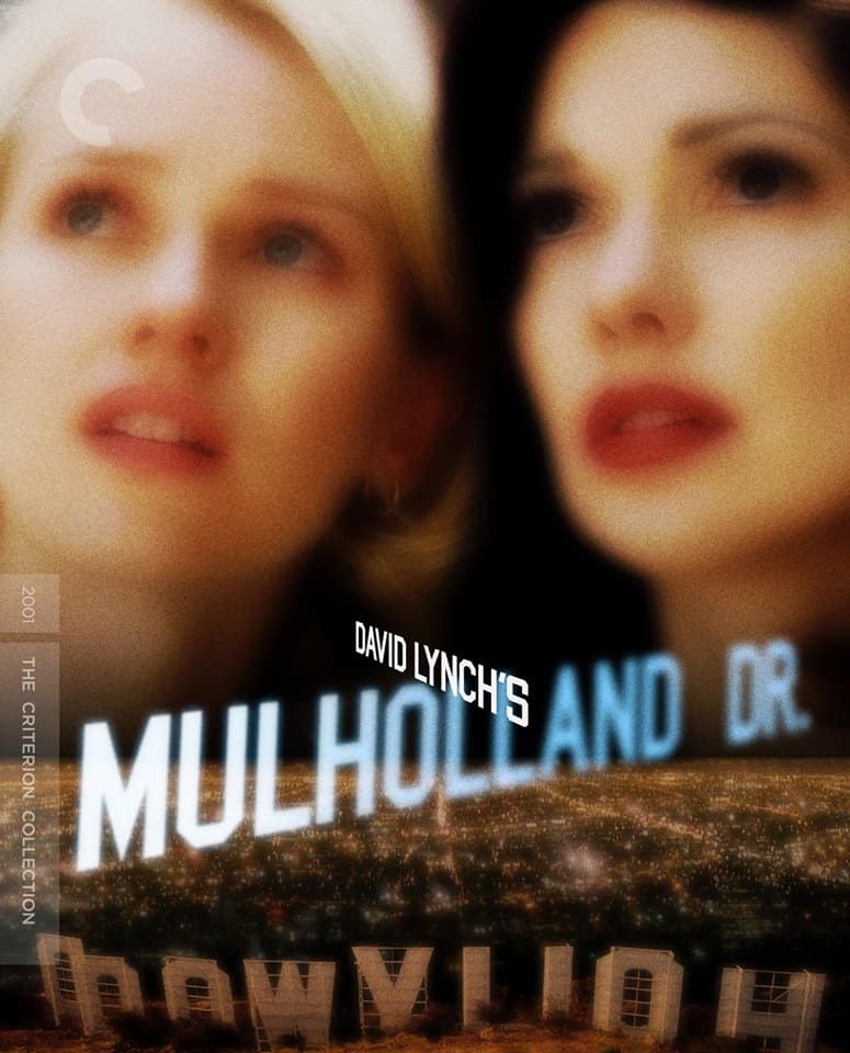
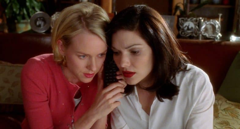
The Criterion Collection release of Mulholland Drive is finally upon us!
Newly restored through a 4K digital transfer supervised by director David Lynch and director of photography Peter Deming, the multi-award winning neo-noir from 2001 will be available along with some exciting new extras on Blu-ray and DVD (Amazon) starting October 27, 2015.
Here are the disc’s special features that have been revealed so far, with several more expected:
- 5.1 surround DTS-HD Master Audio soundtrack on the Blu-ray
- New interviews with David Lynch and Naomi Watts (26:44), Justin Theroux, Laura Harring, Naomi Watts and Johanna Ray (35:38), composer (and actor) Angelo Badalamenti (19:29), Peter Deming and production designer Jack Fisk (22:09)
- On-set footage (24:44)
- Deleted scene at the police station (2:16)
- Interviews with David Lynch and cast members, along with other footage from the film’s set
- A 20-page booklet featuring an interview with David Lynch from filmmaker and writer Chris Rodley’s 2005 edition of the book Lynch on Lynch (Amazon)
- Trailer (1:42)
Order the Blu-ray (1 disc) or DVD (2 discs) via Amazon
How Naomi Watts Was Cast in Mulholland Dr.
Clip from the Blu-ray’s extras via WSJ Speakeasy.
“Naomi came in and did not look exactly like the photograph that I had fallen in love with. […] It was devastating.”
—David Lynch
Blonde Betty Elms (Naomi Watts) has only just arrived in Hollywood to become a movie star when she meets an enigmatic brunette with amnesia (Laura Harring). Meanwhile, as the two set off to solve the second woman’s identity, filmmaker Adam Kesher (Justin Theroux) runs into ominous trouble while casting his latest project. David Lynch’s seductive and scary vision of Los Angeles’s dream factory is one of the true masterpieces of the new millennium, a tale of love, jealousy, and revenge like no other.
Cover art for David Lynch’s Mulholland Drive (The Criterion Collection)

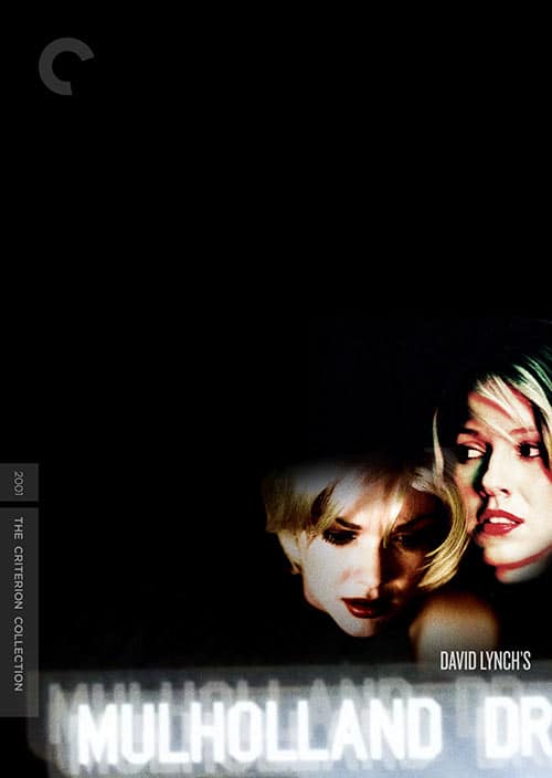
The new cover art above was designed by Fred Davis. Here are some of his other proposals (via Jared Lyon).
Did Criterion select the best one?
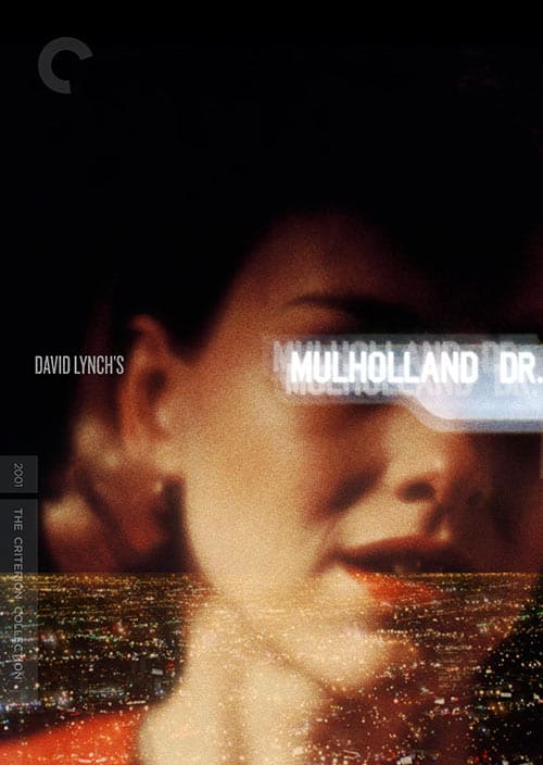
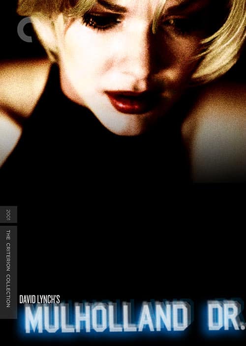
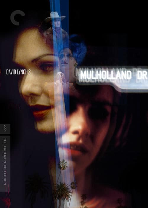

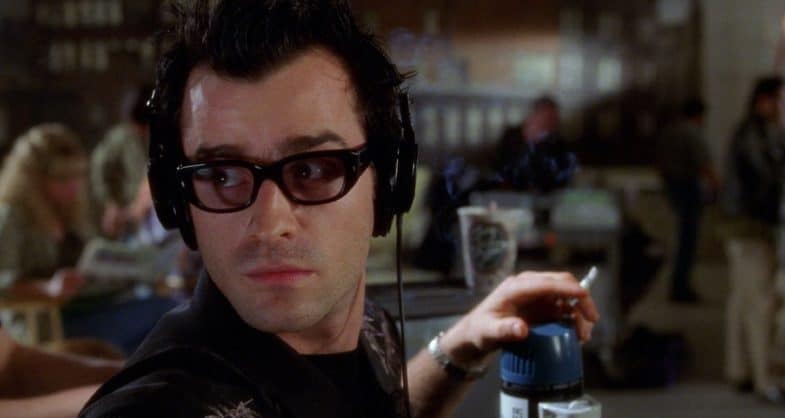


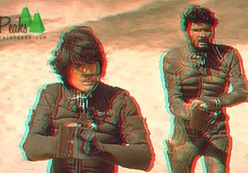


So so so excited for this, but the cover they picked is my least favorite out of all of these.
The last of the rejected covers is definitely the best. They look like zombies or vampires on the actual (blurry) cover.
What a shame that this didn’t not become a series…potential was enormous. :/
I prefer the last one!
The last one is the best for sure. And I wouldn’t count on them adding any more features. They seem to have cut down on them within the last few years. 🙁
I Like All The Cover art except the one they picked
I like the one they picked, I think the blur effect makes sense given the dream like narrative. But I would totally agree with most of you, that last rejected one is the best.
I like the one they picked the best! I can’t wait for this release !
The one they went with is the closest to the spirit of the movie and Lynch’s style.
I think the cover they picked is the best.
The rejected covers are the best ones! (Specially the first one) The chosen one is the worst. I mean, it’s not ugly, but the blur effect makes it look kind of… cheap? Like the person who did it was not very inspired.
Should have chosen the second or third rejected ones!!